Hi, I'm Josef.
Former Game and UX Design student at Futuregames.
I'm currently based in Galway and particularly interested in UI.
I'm currently based in Galway and particularly interested in UI.
| CV | |

As an Intern at Red Marmoset Studios Limited, I worked on menus and HUD for an early version of their upcoming FPS
BAD BLOOD: 1926
When not building directly in Unity, most of my time was spent in Figma.
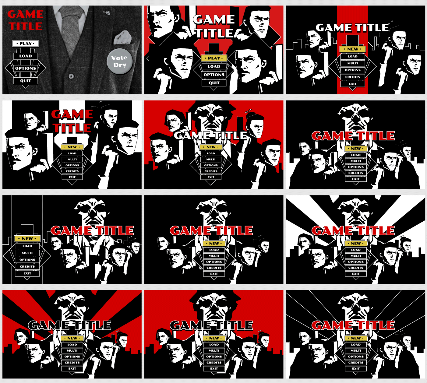
Beyond clarity and ease of navigation, the goal was to evoke Art Deco and prestige gangster cinema. The tilted square shape became a recurring visual motif in the design.
An example of in-engine menu animation from the main menu. Logo removed. I chose the fonts and created the buttons, the animation, and the overall design, but the skyline and the red-eyed men are placeholders from older concept art.
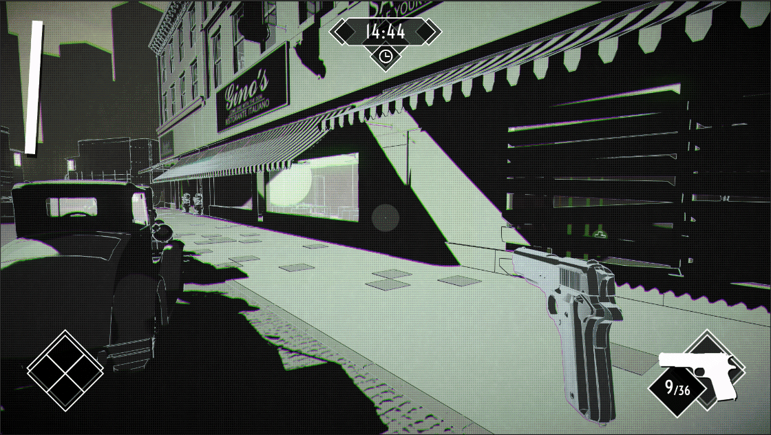
The HUD is a mixture of Overwatch and Dishonored, with a different visual flair. White silhouettes clarify which weapon is currently equipped. The timer at the top appears when time is running out.
Unity screenshot above.
Main menu sketches from Figma. The suit is an edited placeholder photo from image search. The placeholder character is a quick sketch I made of Clint Eastwood, intended to be 3D player characters in the final version.
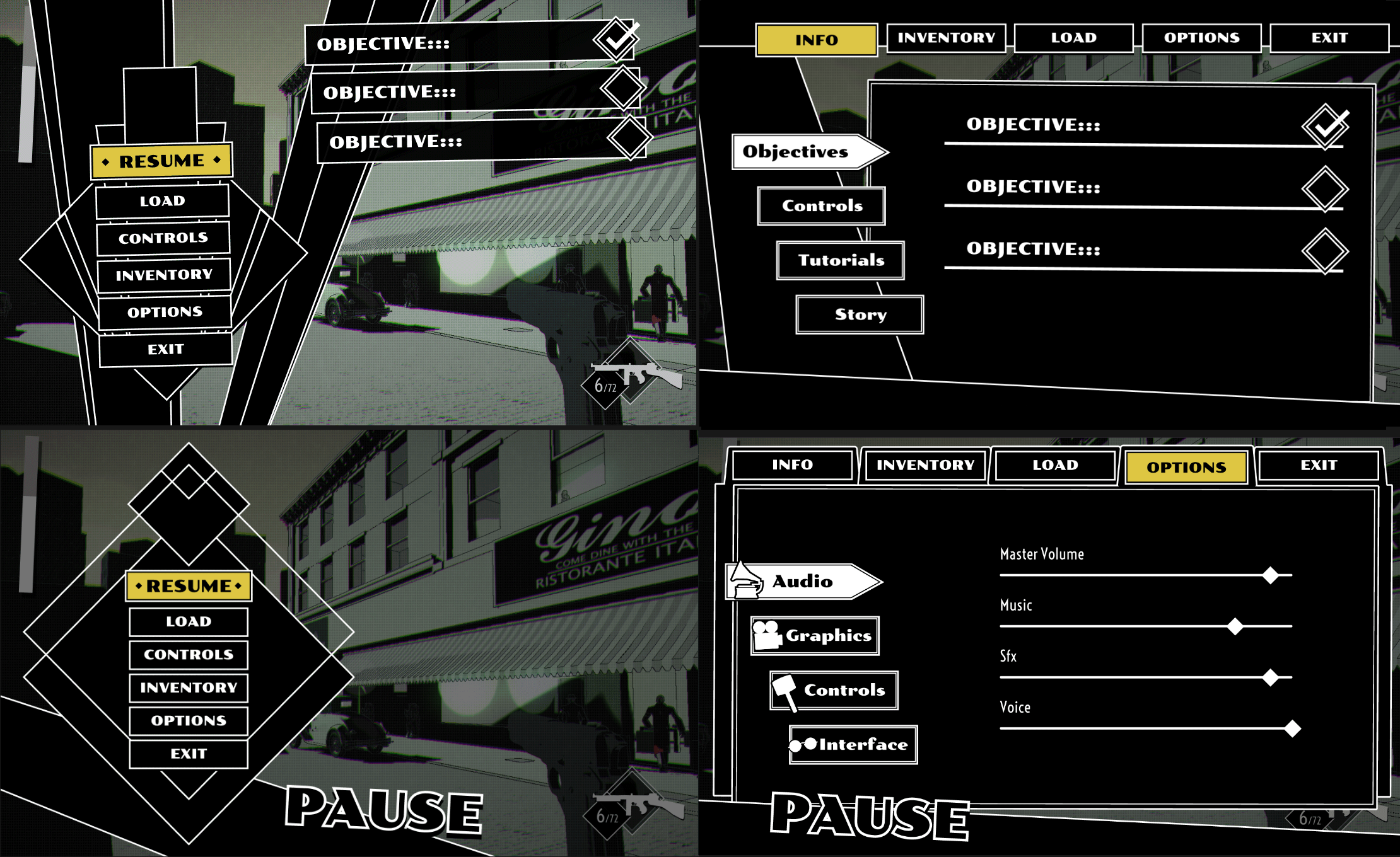
The Pause Menu is designed to look like a filing system. Some files have subcategories of their own.
The Options menu is divided into Audio (volume), Graphics (resolution/quality), Controls (button mapping etc.), and Interface (HUD/Accessibility). I experimented with time appropriate icons, for clarity.
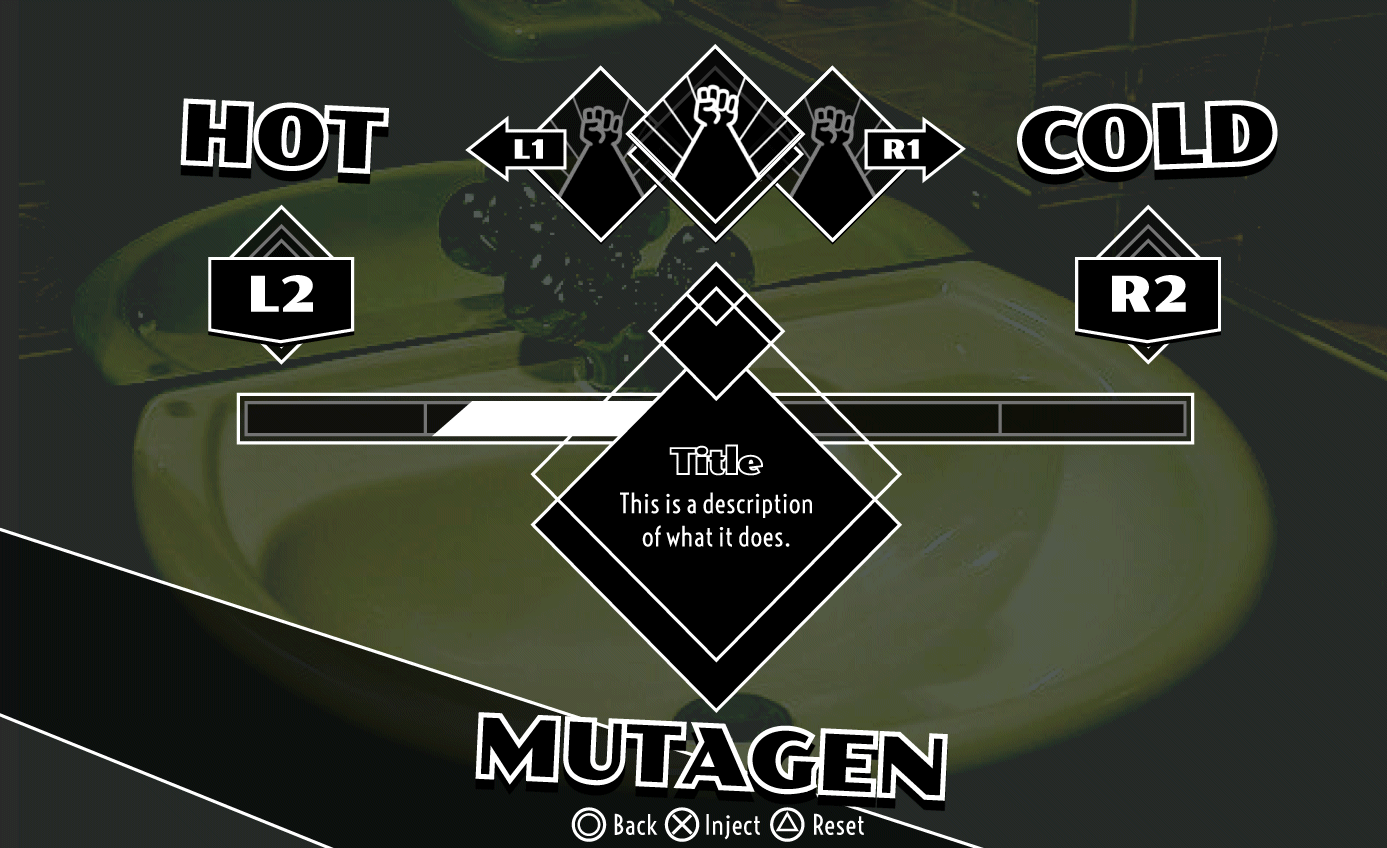
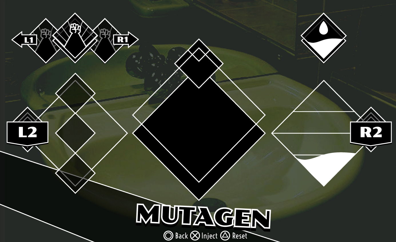
Figma mockups of a Crafting Menu for mutagens. The mutagen system is, at time of writing, not set in stone. The basic idea is that you dilute the mutagen with water from the sink. The instructions above are for a Playstation controller.
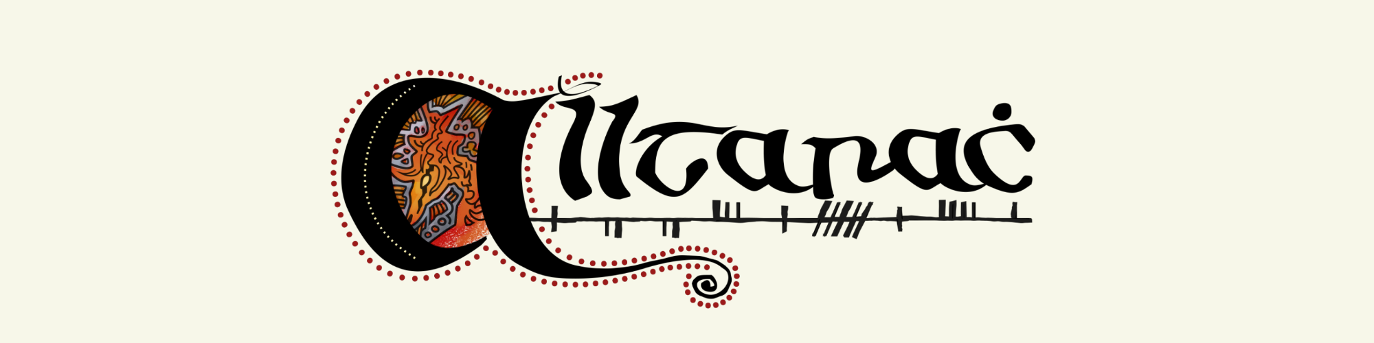
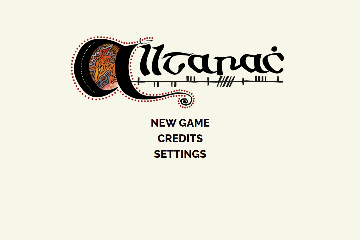
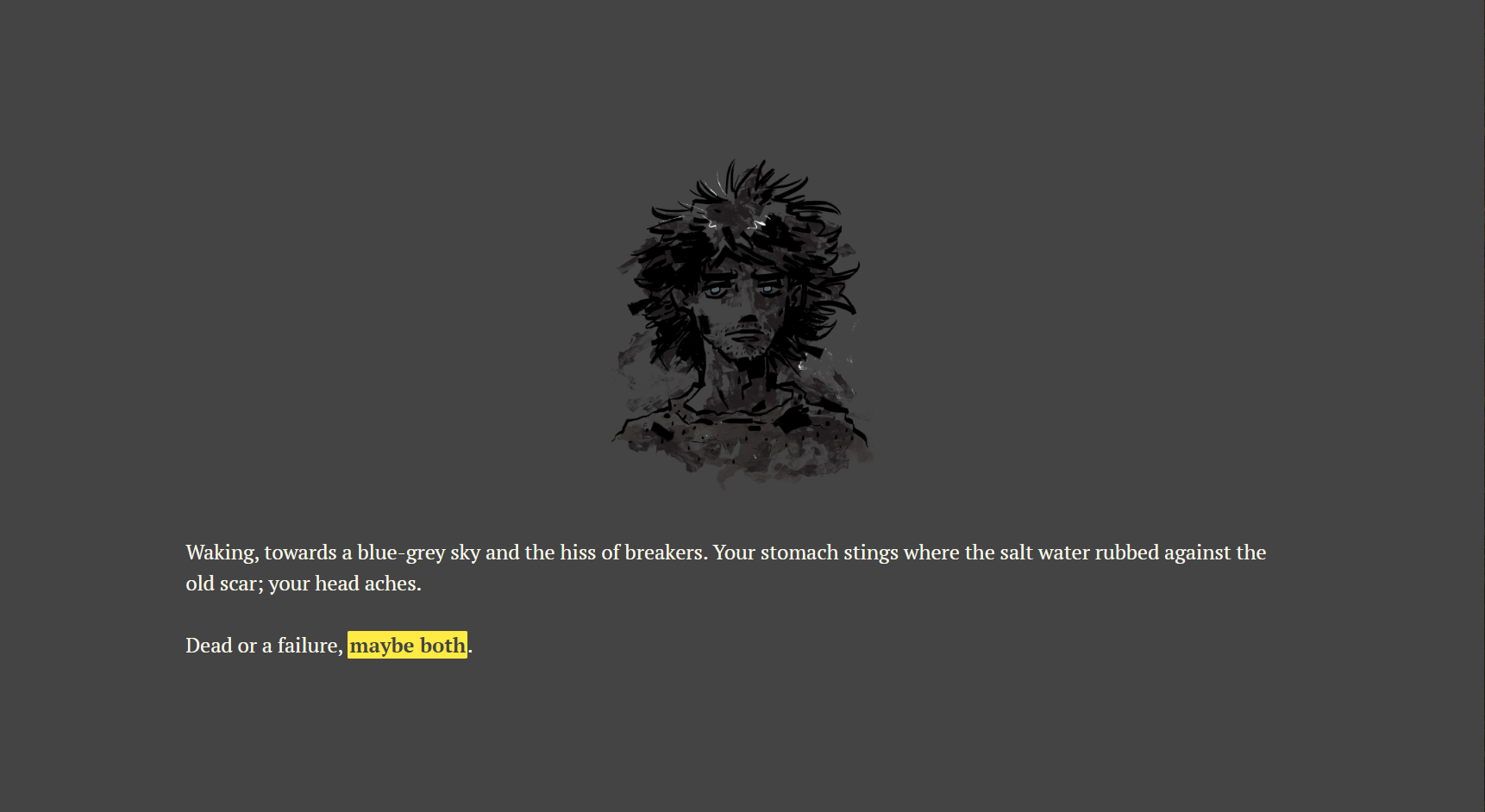
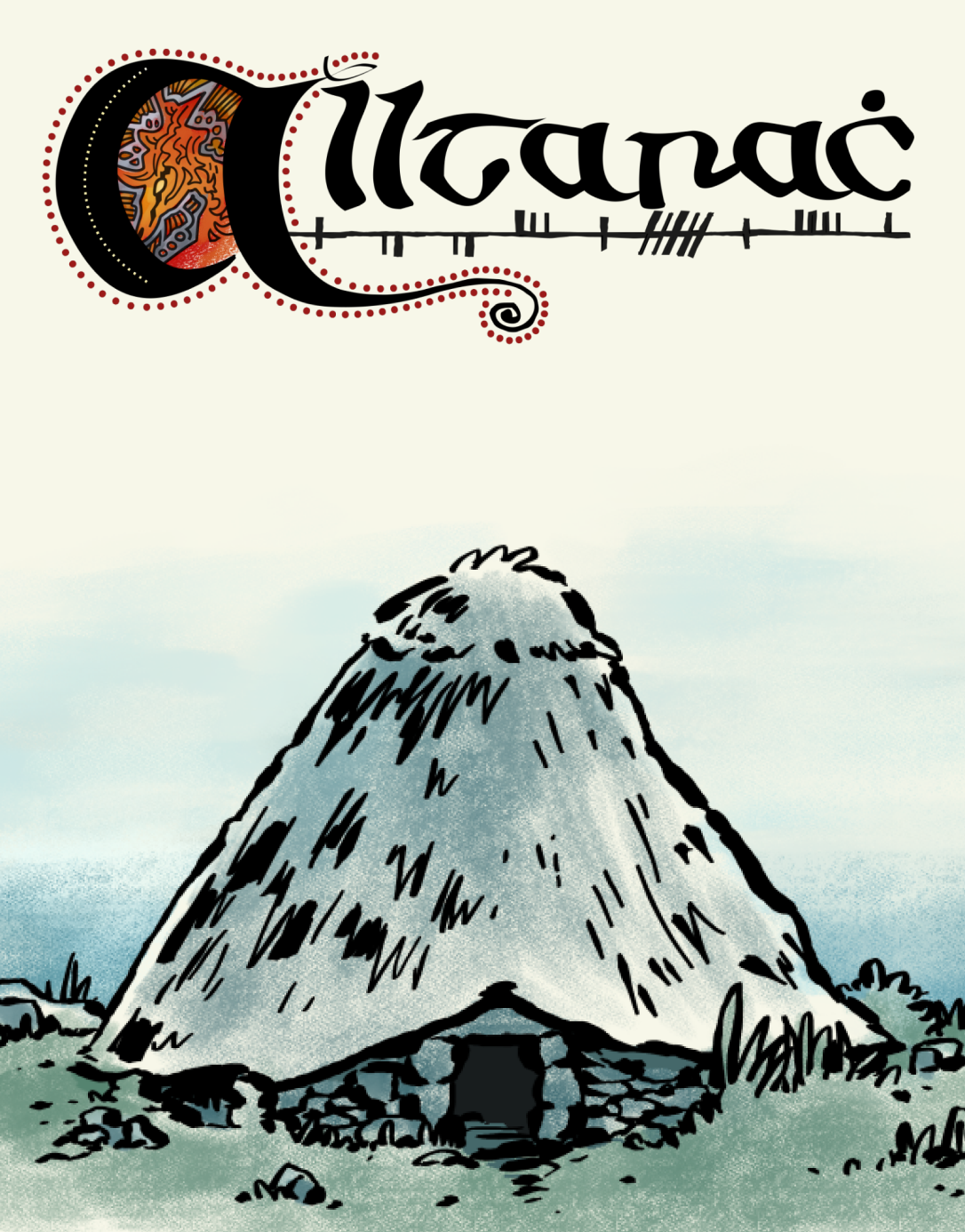
“Alltarach” is a branching illustrated novel set in a semi-fantastical version of 6th century Ireland — a generation after the passing of the Apostle Patrick. You follow the perspective of Bríd, a teenage orphan from a rocky island off the west coast. Her brother didn’t wake her this morning.
A personal project where I teamed up with a writer.
Submitted to the
2024 Spring Thing Festival.
The full game is available on the
Alltarach Itch.io page
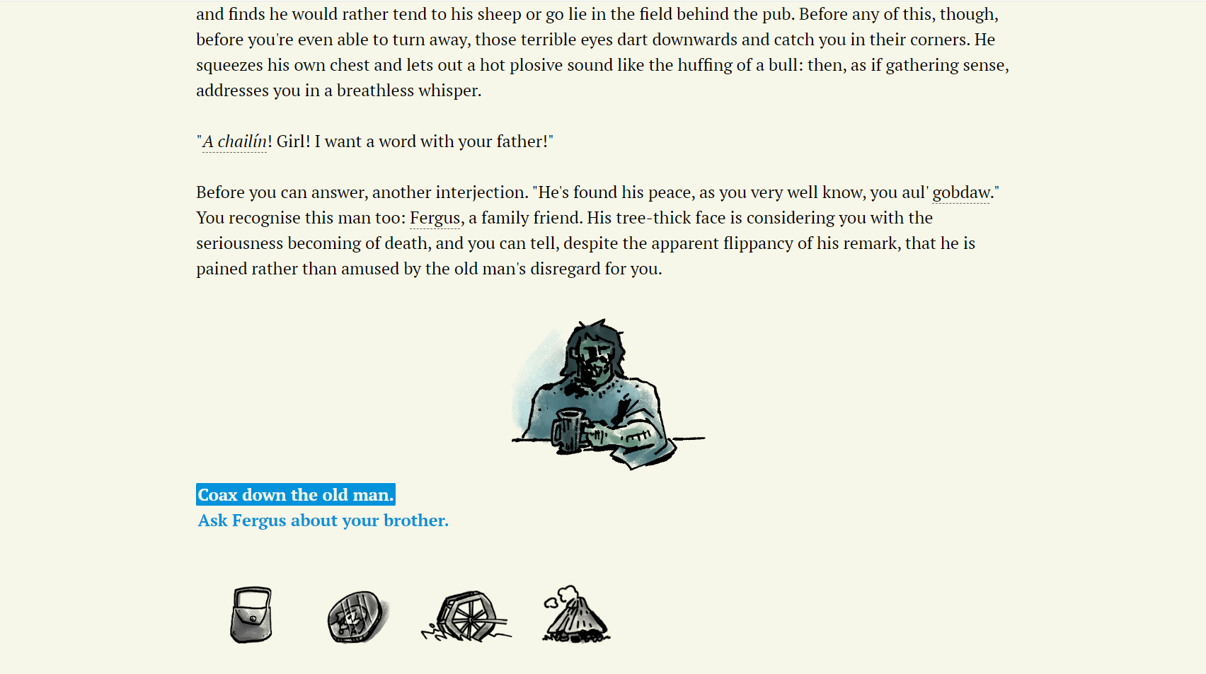
I opted for blue or yellow bolded text for links.
The two link colors are never used on the same page and the link text switches backdrop and text colour when you hover, in order to maintain clear visibility for colour blind players.
You can also hover over underlined text for annotations about pronunciation or meaning.
The yellow links are for the sections where you play as your brother, which feature a semi-inverted colour scheme. Making these sections visually distinct at a glance was very important for the late game.
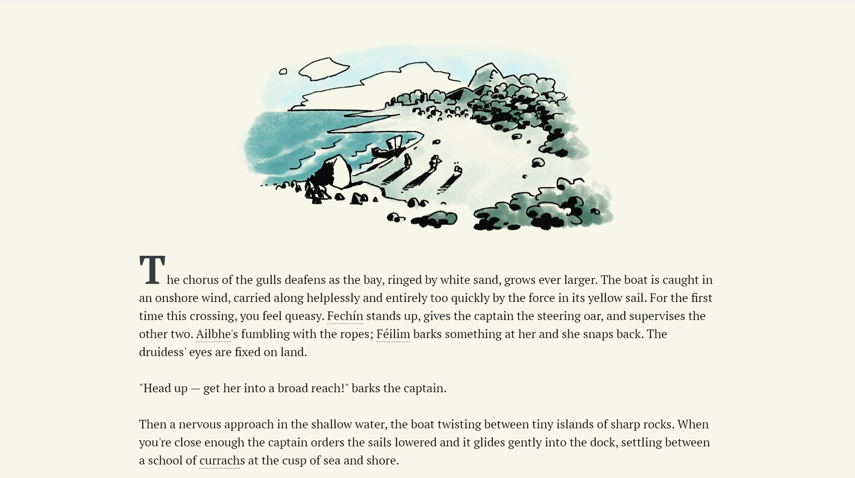
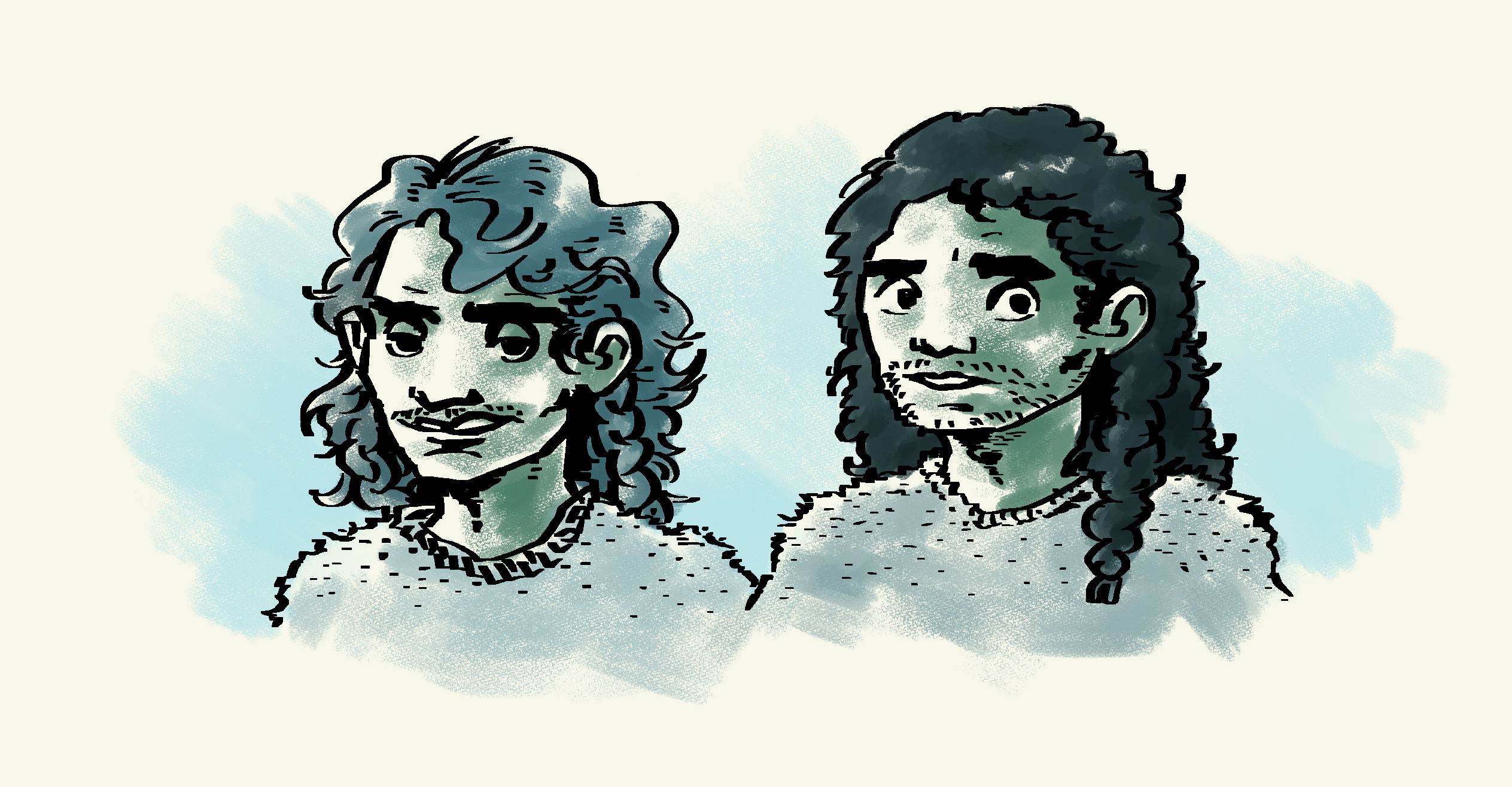
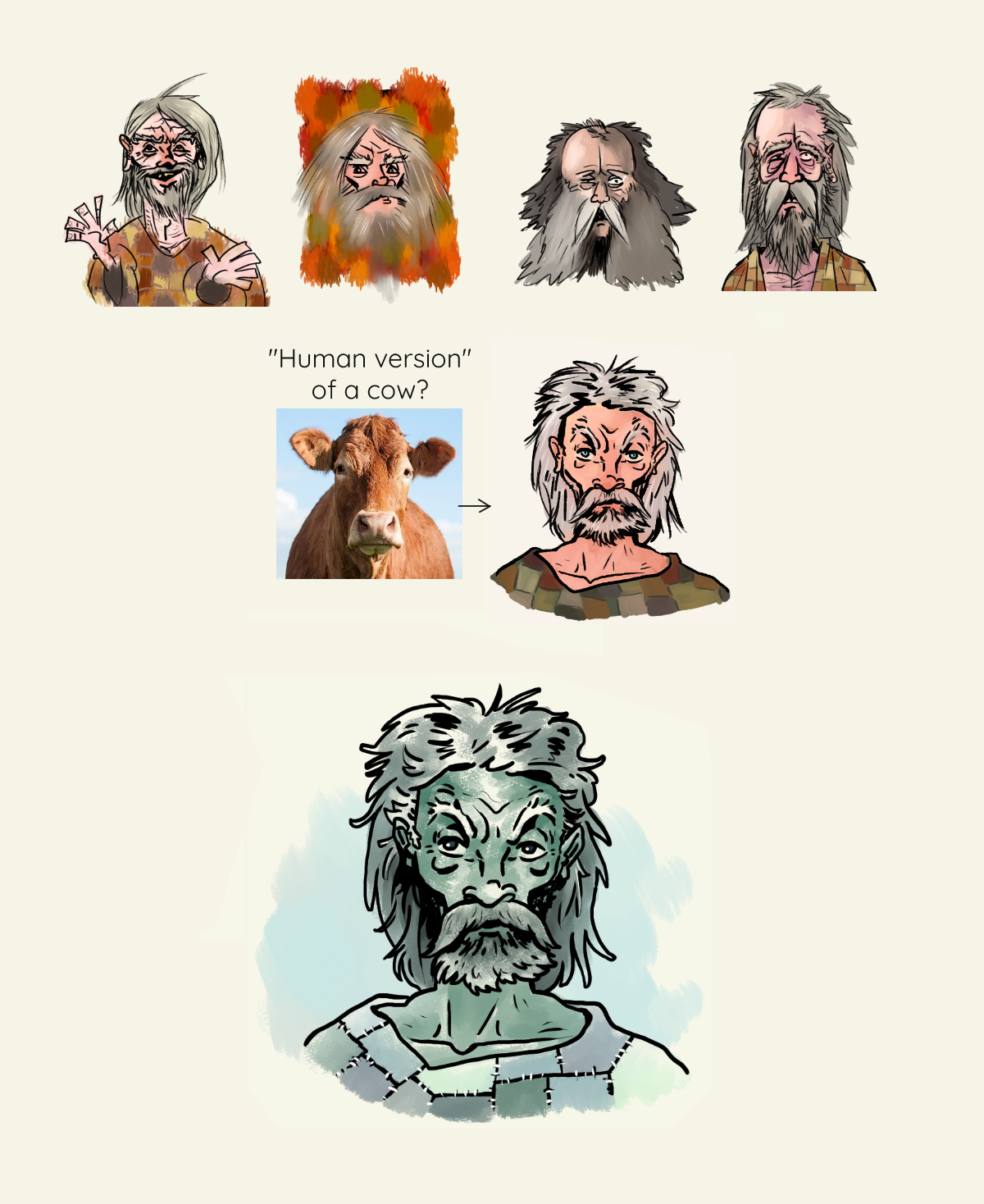
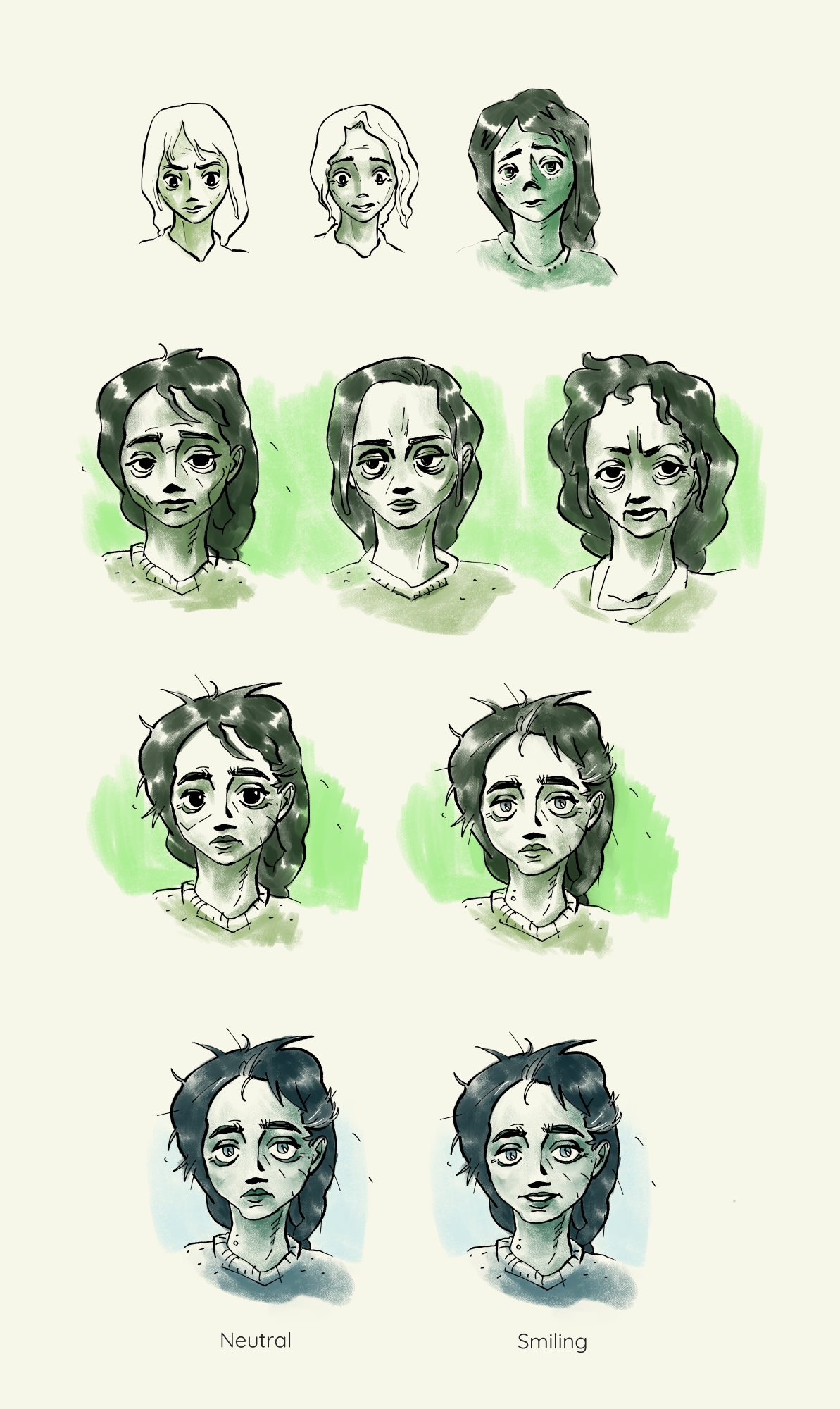
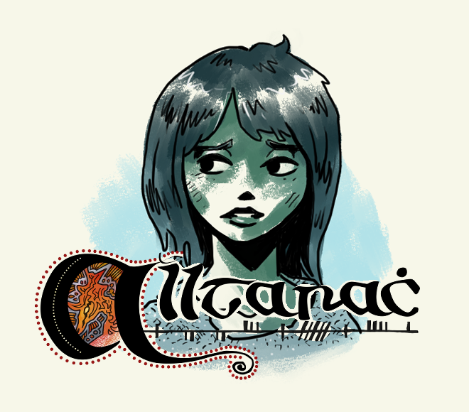
For the character illustrations, I intentionally limited the palette. It's meant to evoke a storybook vibe, as well as the wind, rocks, and water of the Irish west coast.
The differently coloured drawings above are from the early character design iteration process, before deciding on the final palette.
I based the letters of the logo on the earliest forms I could find of insular script, with the same word in Ogham underneath. The original placeholder of the art inside the initial A is a rough sketch of an abstract púca drawing I’d seen on a book cover once.
The final version is a creature I imagine as somewhere between a badger and a horse, surrounded by dots and lines. Apart from the concept sketches and final colours, the logo is created in Illustrator.
I also designed icons for accessing your inventory, a list of characters, the settings, and returning to the main menu.
Drew a bag for inventory, a mirror for the character list, and the main character's house for the "home" icon. Settings was more complicated. The traditional cog felt too modern. I went with a water wheel. Older, but similar.
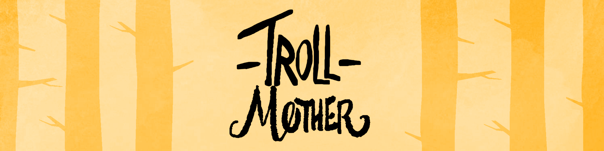

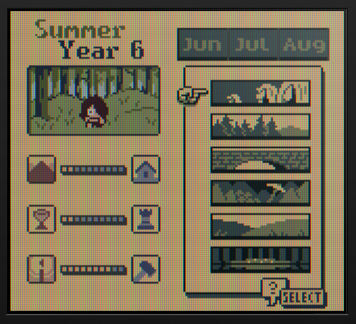
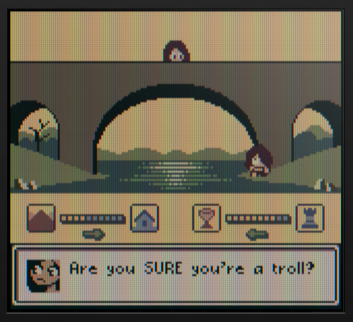
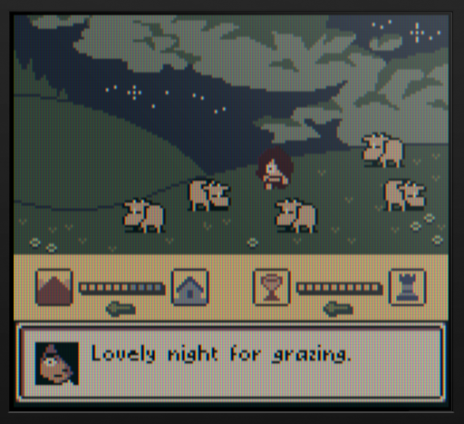
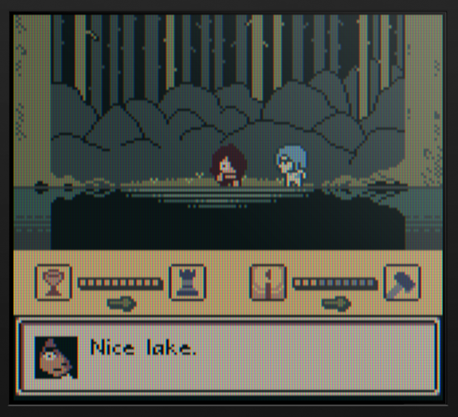
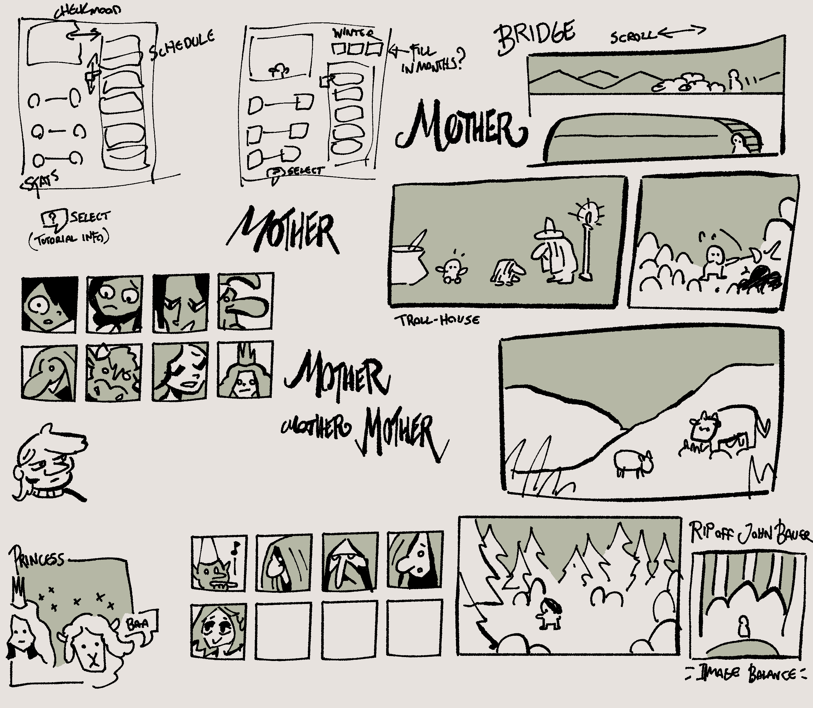
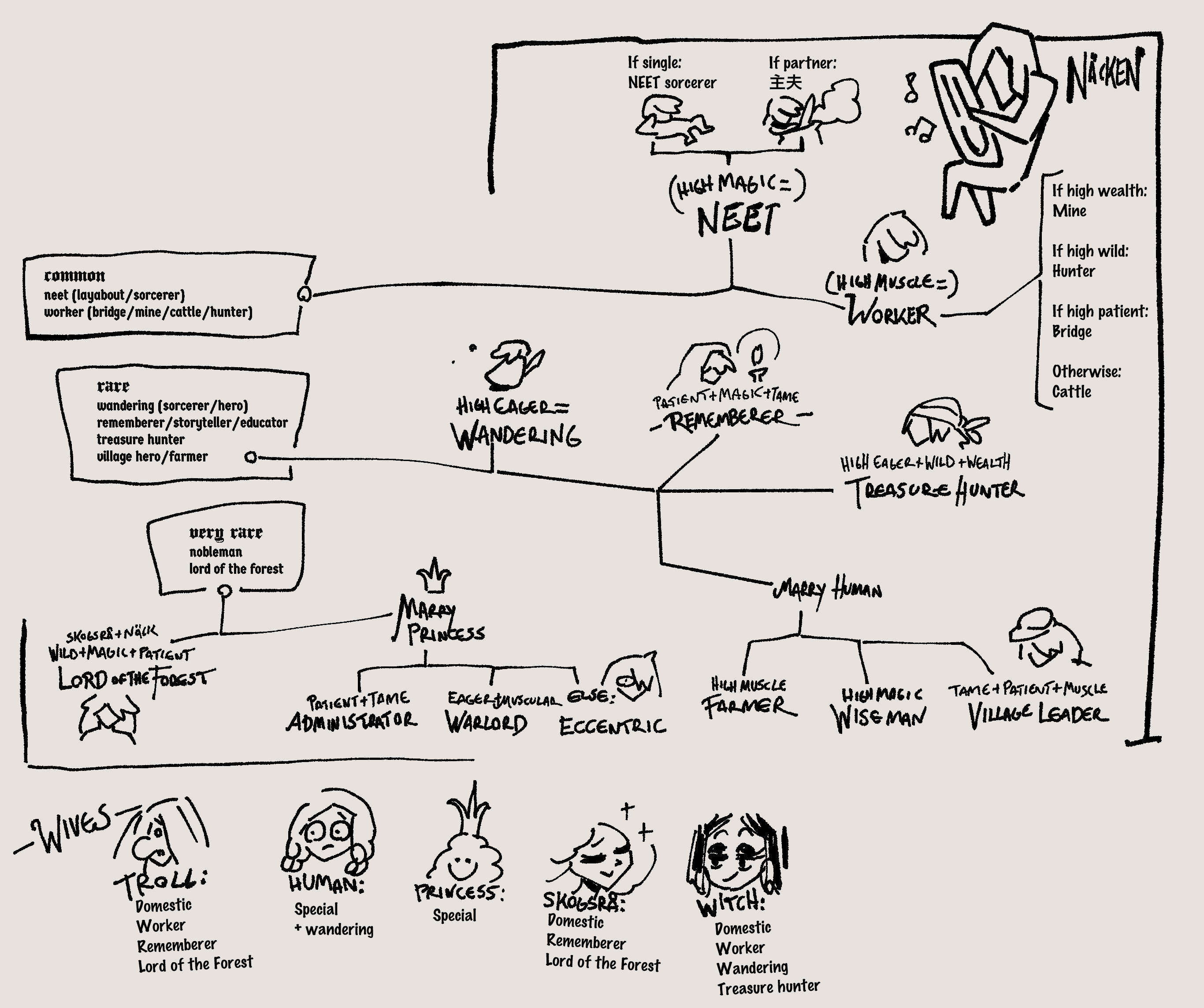
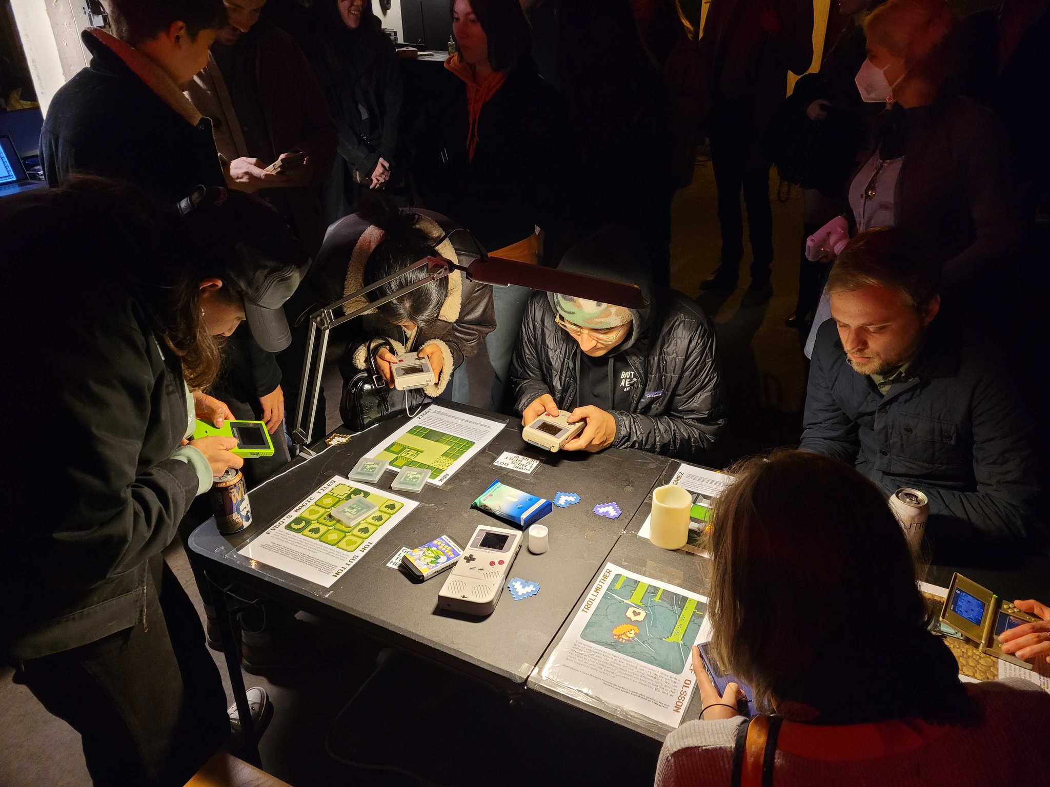
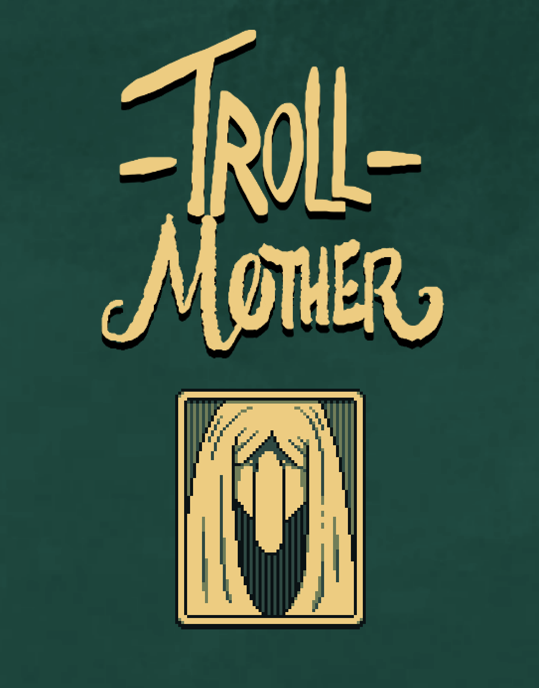
“Trollmother” is a branching narrative game about a troll who raises a human boy. You do this by setting schedules, stat building, and conversation.
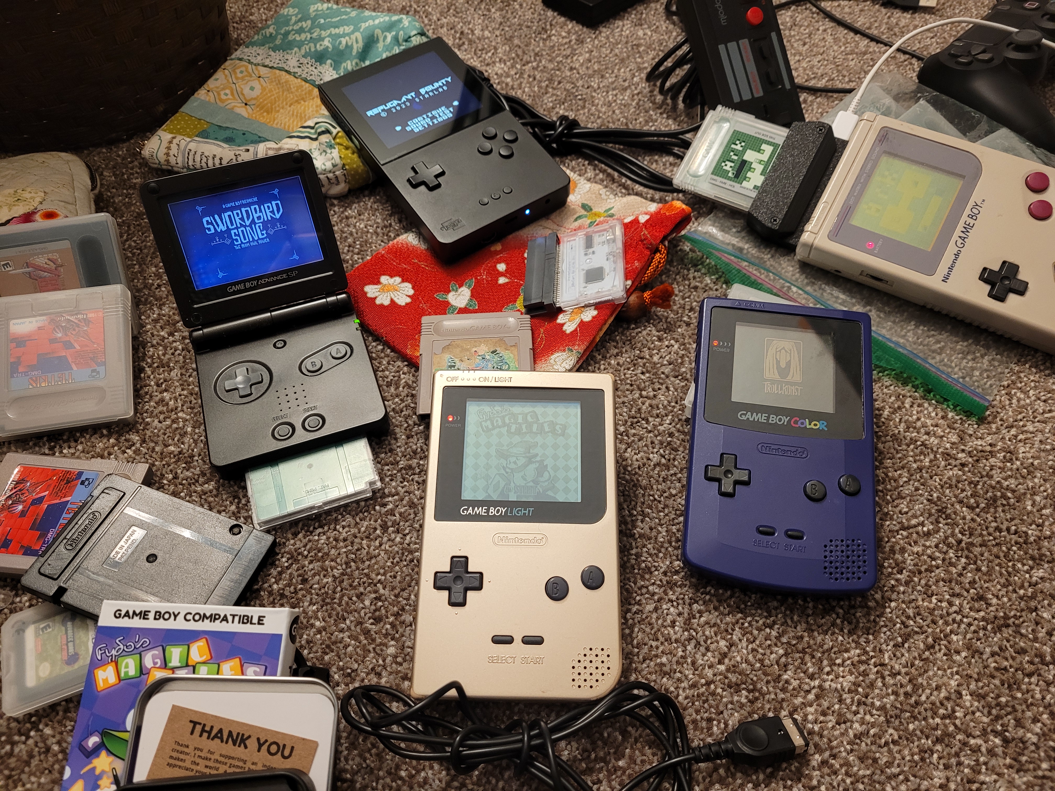
Made for an itch.io Game Boy competition with the theme "You are the monster".
The game is subject to the limitations of the Game Boy hardware, including strict limitations on the number of 8x8 tiles present in a scene and a maximum of three colours per sprite.
One of my goals was cultural specificity, to make it unapologetically Scandinavian.
The full game is available on the
Trollmother Itch.io page
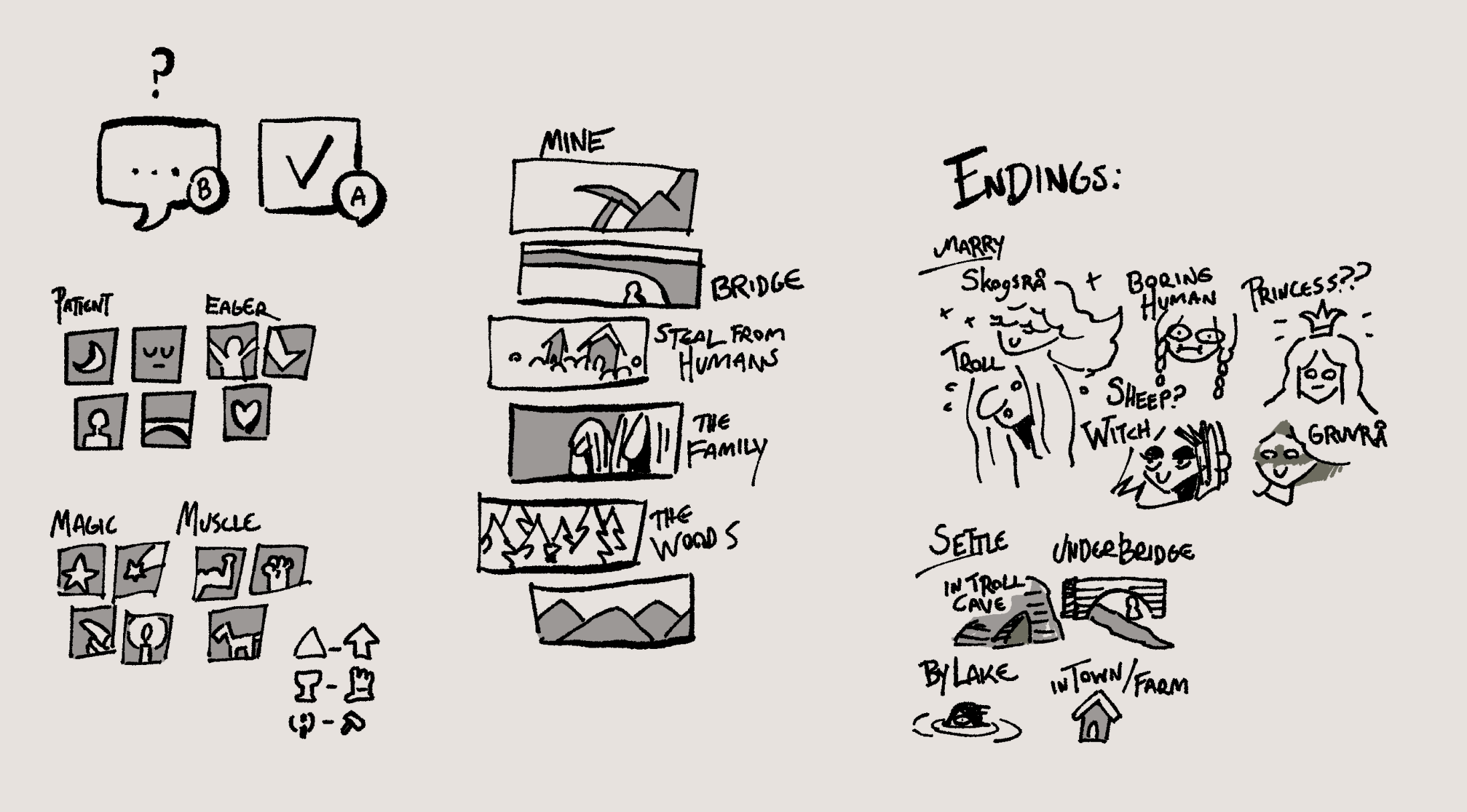
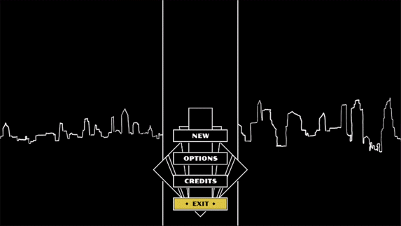
I decided to limit all stats and navigation to a single screen, to avoid having to go back and fourth.
All stats come in opposing pairs, to make it easier to parse and to reduce the number of stat bars.
I planned story trajectories early to keep the writing efficient.
Games like this require a variety of end states to feel satisfying,
so I started at the end, planning out potential endings before I'd written anything else.
There's an update in development, adding not only new events and improved art, but some mechanics as well.
The game was featured at the 12th iteration of the Heart Projector Pop-up Arcade in Vancouver, Canada.
I wrote a more detailed breakdown of development and design challenges in one of my devlogs:
Making of Trollmother
| CV | |